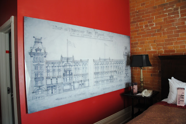
As promised, here's a peek inside one of the rooms at the Gladstone Hotel. This one was designed by Bruno Billio and it uses a lot of antique accessories and furnishings from the original Gladstone building, but what I really love is that red wall and architectural style drawing. Unfortunately, it's hard to get a good overview shot as the rooms are not so spacious, but I hope this gives you and idea of how nice the rooms are.
Subscribe to:
Post Comments (Atom)


12 comments:
Now isn't that a grand idea - decorate the place with the drawings! I like it!
«Louis» likes this, too!
(Especially the architectural drawing against the red wall.)
j'aime bien aussi les briques du mur, c'est assez special pour un hotel
Pour moi ce serait très dépaysant avec les briques, comme un appartement à NYC.
It's indeed a different room!I guess I would prefer something more light,and maybe more romantic! ;)
Léia
The drawing hanging an the wall is very attractive here.
The drawing makes this room special!
Novel wall decoration. From that, you can see that this is just not any old carbon copy hotel.
I like the red wall and the brick, wow, beautiful. The drawing adds so much more to this room.
Where did he get the plans for my house?
I like when people use blueprints for artwork.
Wonderful!
Post a Comment
I hate the new word verification. Since I have trouble reading those "words", I am assuming others do too.